
7 December 2023 · 2 min read · Gosia
How to let a design breathe
In design, “breathing room” is the space between the elements we want our audience to notice. It is a moment’s pause — relief from a flood of information, time to take in what…

In design, “breathing room” is the space between the elements we want our audience to notice. It is a moment’s pause — relief from a flood of information, time to take in what has been said, and a chance to signal that the context will change in the next section. Without breaks between sections you risk information overload, which has the opposite effect to the one intended, because the user feels lost and overwhelmed.
Using breathing room in a design is the skill of using empty space and placing elements strategically to create a pleasant experience. It is more than a choice driven purely by aesthetics — it is a strategic design approach that lets you focus the user’s attention precisely on what matters most. In practice it means limiting information to the key points, removing unnecessary decoration and directing attention to what really counts.
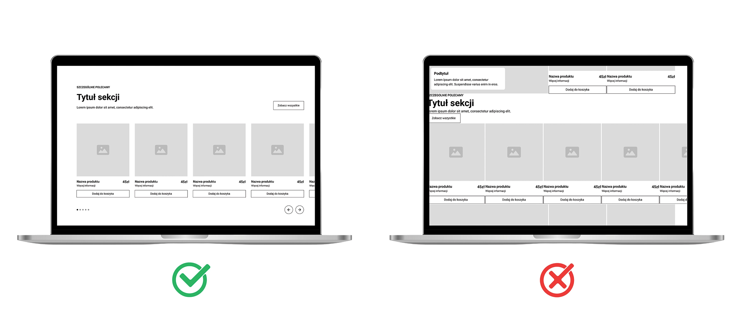
The example closest to hand is a website with a simple but clear interface. White space in the form of margins and gaps between elements helps separate individual components, and a minimalist design makes it easy to focus on the content.
In design, using space well is an art. It is the ability to fill only what needs filling with content, while leaving room to breathe. Design then becomes not just the functional delivery of information, but also the building of a relationship with the user through a considered layout, a legible message and respect for their time and attention.